
There's no shortage of T-shirts celebrating your favorite team, school or organization. Finding one you actually want to wear? That's another story.
Kansas City entrepreneur Amy Lee Sewell saw an opportunity to change that.
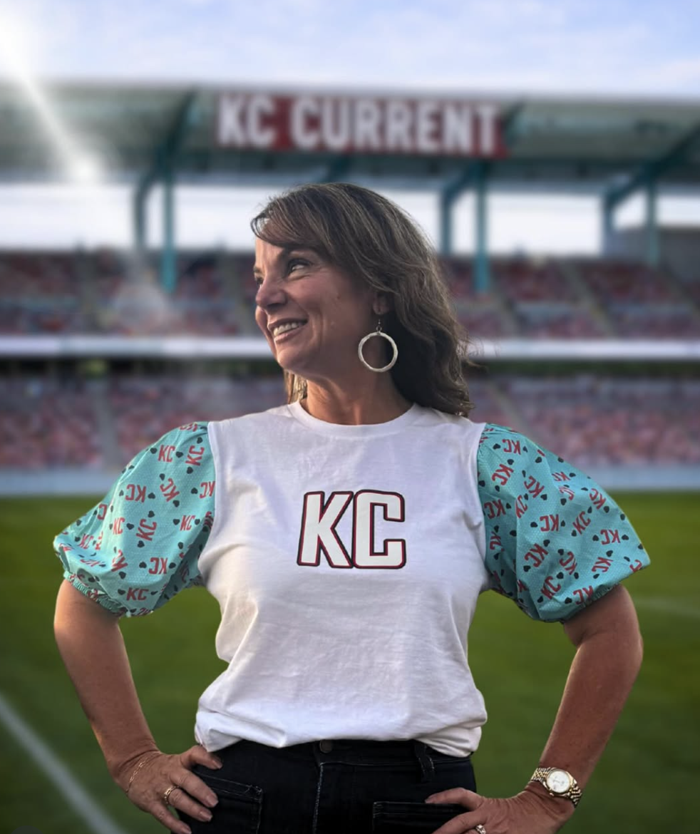
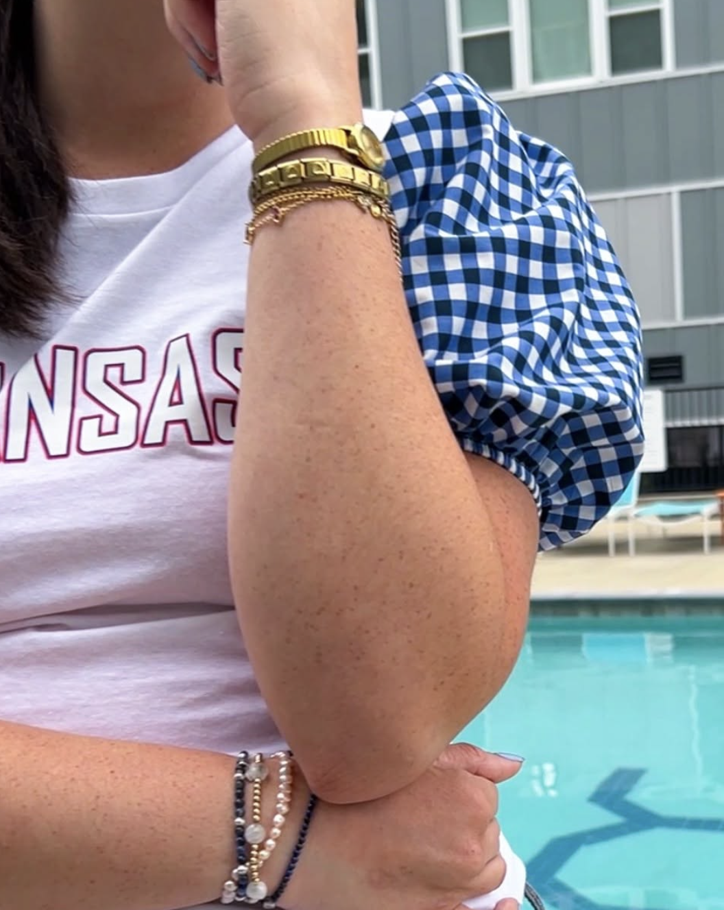
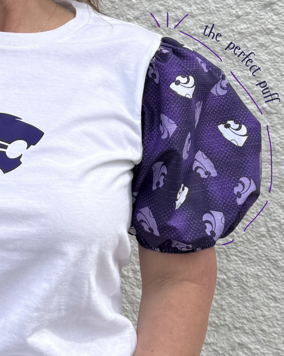
Her company, Puffytees, puts a fashionable spin on traditional spirit wear, pairing classic tees with custom-designed puff sleeves. The result is equal parts comfortable, spirited and stylish — designed and sewn by women, for women, in Kansas City.
The product had personality from the start. Our job was to make sure the brand did, too.

Finding the sweet spot.
Puffytees isn't quite a fashion label. It isn't quite a spirit-wear company. And that's precisely its appeal. Its customers want to show their team pride, support their schools and represent their organizations. But they also want to look good doing it.
We needed to communicate the customization customers expect from branded apparel with the style and personality they look for in a boutique. The brand had to feel polished without being precious, playful without being juvenile and spirited without looking like everything else in the stands.
Before we considered colors or logos, we focused on the people Puffytees wanted to reach and what would make the brand meaningful to them.
Four words that say it all.
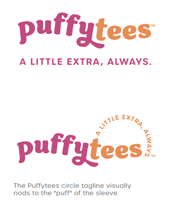
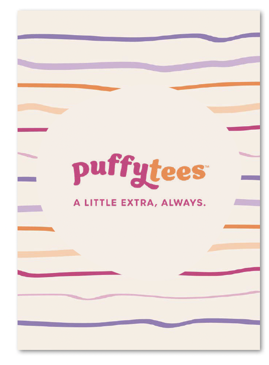
A little extra, always. It's a fitting tagline for a company that takes an everyday staple and gives it an unexpected twist.
The line does more than describe the product; it captures its attitude.
Puffytees is for the woman who loves a good theme, never misses a chance to show her spirit and believes getting dressed should be fun.
The tagline gave us a simple, memorable way to communicate that personality across the brand. It also established a direction for the creative: colorful, confident, feminine and just a little unexpected.
Making every detail count.
With the positioning in place, we partnered with art director Julianne McCarthy to develop Puffytees' visual identity.
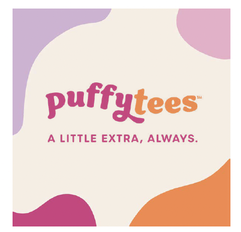
A punchy raspberry pink and sun-warmed tangerine set the tone, with lavender, soft lilac and warm cream rounding out the palette. Rounded typography keeps things approachable, while playful florals, stripes and organic shapes give the brand its unmistakable personality.
The logo system includes a circular tagline treatment that subtly nods to the puff sleeve itself.
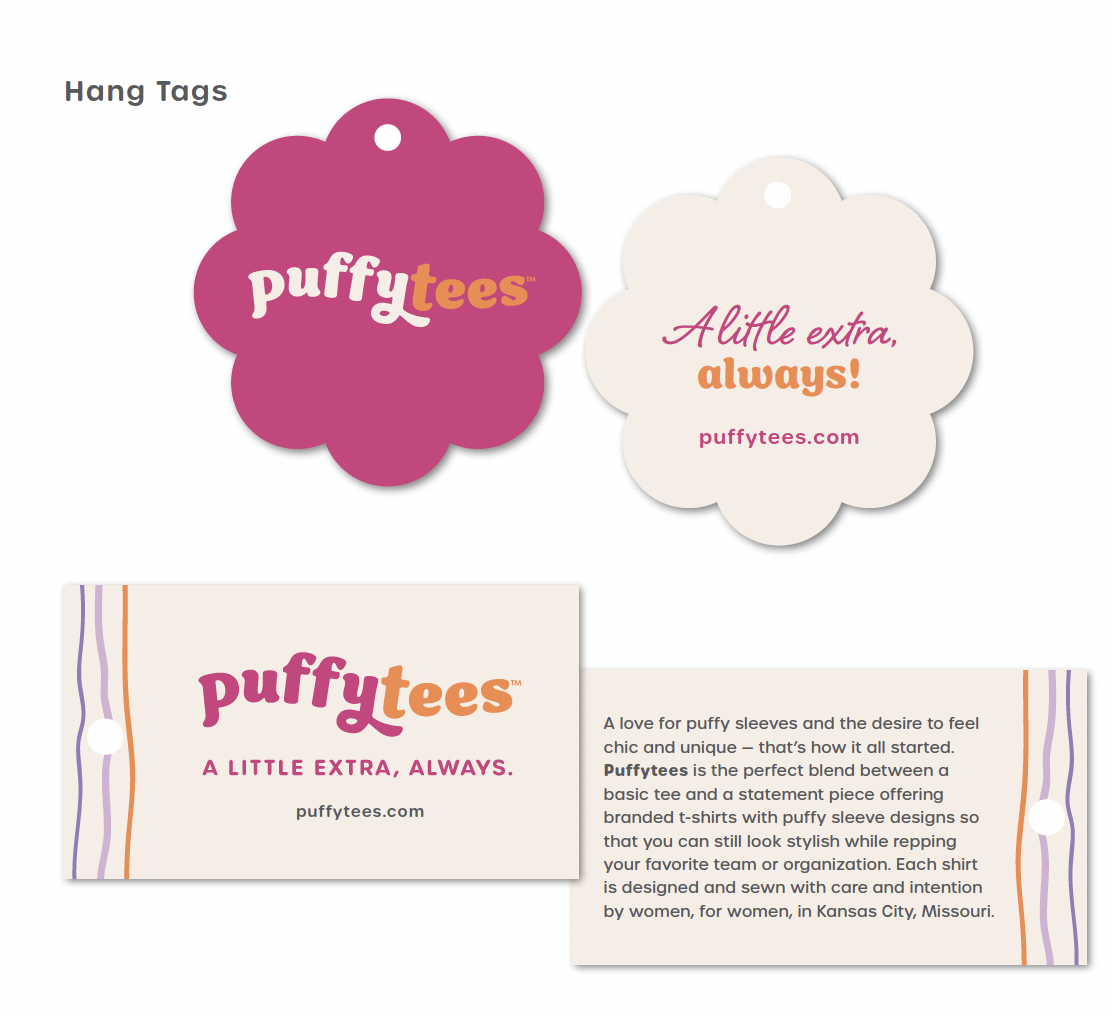
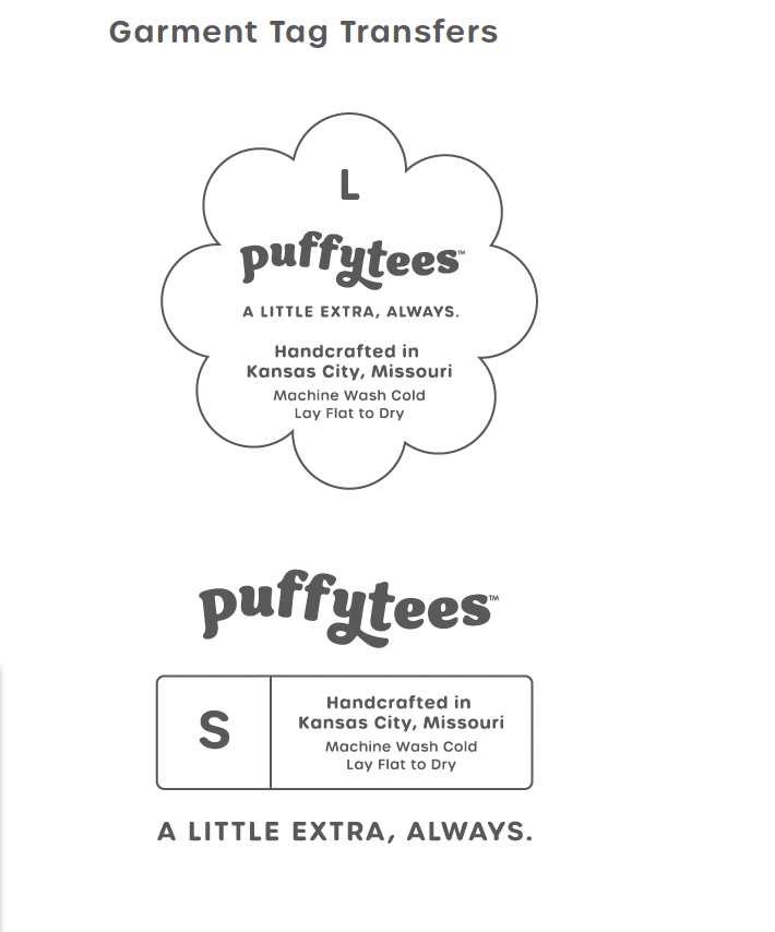
We developed hang tags, garment transfers, order inserts, social media applications and a comprehensive style guide to carry the identity across the customer experience.
The best Part? Seeing it out in the world.
Since completing the brand work, we've loved watching Amy Lee and her team put it to use.
A connection with a local teacher turned into a flurry of word-of-mouth orders. After hearing from customers who wanted matching styles for their daughters, Amy Lee recently launched Puffytees in youth sizes, bringing the brand's signature style to a younger crowd. The company has also secured collegiate licensing and hosted pop-ups at various events across Kansas City.
The business is finding an enthusiastic audience, and Amy Lee is listening closely to what customers want.
She also shared a note that meant a great deal to our team:
“Our branding is just perfect. Your support means the world to us!”
Why This Work Matters
We love a beautiful brand identity. But the thinking behind it is what makes the work worthwhile.
For Puffytees, that meant understanding why a woman would choose one of its shirts over a traditional team tee. It meant recognizing that customization was only part of the appeal. The bigger story was about personal style, confidence and having fun with what you wear.
That's the work we love at Storia Strategies: getting to know a business, understanding the audiences that matter most and finding the right way to connect the two.
Cheers to Puffytees and to being a little extra, always!
